May 8, 2018
It can be scary to realize a print’s underbase is showing when it shouldn’t be. Many times, a design’s top colors should completely cover the underbase, but a variety of things can happen to cause the white print on a dark garment to spread slightly and peek out from beneath the edges of the top colors.
If clients see this, they may complain and even reject the job, so don’t take chances with separations and create an allowance for the underbase to adjust, depending on your registration tightness and stability.
If you are new to screen printing, the top colors that are brighter — such as red, blue and green — will look faded and could even change without an underbase on a shirt that isn’t white. The underbase typically is designed to be printed under all of a design’s colors except black.
Creating separations for screen printing isn’t just a simple process of duplicating all of a design’s top colors and mashing them together to create an underbase. You must consider how the final print will look.
Designing an Underbase
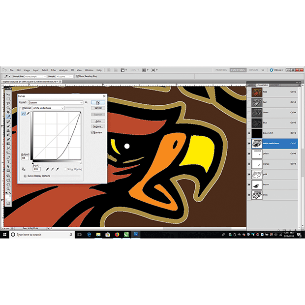
It should be easy to create an underbase for a simple spot-color design (see Figure 1). In Adobe Photoshop, you can see how an underbase will work for a design by creating a simulated digital mockup using alpha channels below the image channels. Input each color separation into a channel and create a shirt channel, then turn on each channel in descending print order to show how the print will build out on the press.
The advantage of doing this is that you can see where the underbase is visible underneath other colors. All it takes is a push in the middle of the Curves menu to determine whether the underbase will gain enough to show past the design’s edges (see Figure 2).
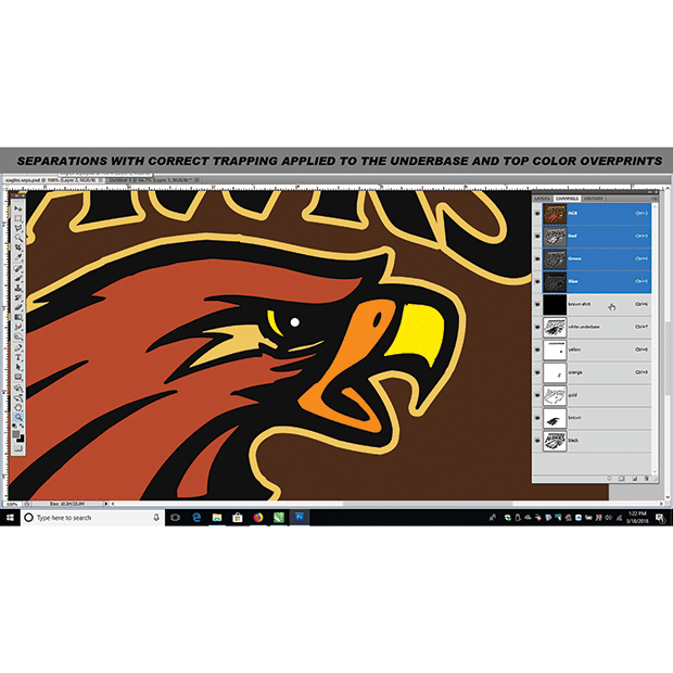
It makes sense to compensate for the spreading of the white ink in different ways to avoid combatting it on press. Perform test prints with high-contrast and kiss registration (where the print barely touches the neighboring color and doesn’t overlap). Using a detailed test print will reveal whether the press and some production areas need adjustment prior to creating compensation at the artwork’s edges. (see Figure 3)
Once you have adjusted equipment to achieve the least amount of gain at the underbase’s edges, you can create a method to compensate for this in artwork.
Adjusting Artwork
There are multiple ways of creating an allowance for the underbase so that it doesn’t show. The key is to adjust the artwork as little as possible to retain as much of the original design’s look and edge quality without risking any problems on press. The artwork’s quality and some specific variables dramatically can affect how underbase modification works.
If the artwork has tiny lines and broken-up small pieces, then contracting the underbase may diminish or eliminate it in many areas. This may be an issue because the color may not show up. In such cases, try slightly enlarging the colored areas or adjusting the underbase and top colors halfway to avoid damaging the final print.
In Photoshop, select the color channel for which you are adjusting the underbase and click on it. Select the active image area instead of the inverse. (If you have the inverse selected, lines will show on the border of the channel, as well as the image areas.)
Inside the underbase channel, you can edit a solid image’s edges by selecting the stroke command under the Edit menu and then stroke the edges by two to four pixels using the center option. This will trim the underbase just enough to allow the top color to slightly move and not let the underbase show. This type of edit is best for images with solid areas that need compensation (see Figure 4).
An image with solid colors and lots of little pieces requires making a decision regarding how much to adjust the file. In such cases, create copies of the underbase channel and the color channel being edited (drag the respective channels on the New Channel button or use the Duplicate Channel command). The copied channels can then be left visible (with the eye selected) and the original channels can be turned off so that the edits will be the only visible options.
Once these copies are ready, a stroke can be applied to some or all of the color channels border, as well as to the underbase. Using the stroke command should be reserved for files with mostly solid borders. Any blurry edges or grayscale areas that are stroked will create weird effects instead of proper editing that stays confined to the colors’ borders.
In the case of vector programs like CorelDRAW or Adobe Illustrator, creating a separation with a slight underbase contraction is a similar process. The underbase element shapes are outlined with white to cut away slightly at the edges and allow the top color separation to overlap just enough to cover.
Fading & Transparent Colors
The process of adjusting an underbase so that a shadowy fade on a dark shirt looks correct should be done carefully. It often is best to perform tests if you are new to halftone underbases — particularly those where the shirt color creates the value as the top color fades out.
A simple test file with an underbase that fades out in swatches with a top color overprinted in a variety of opacities should indicate how much you can do with regard to a broken underbase and a top color that is semi-transparent. If the top color is too broken up, then even a light underbase halftone may show through in spots, making the print look grainy and ruining the illusion of the print fading into the shirt. The halftone must be completely covered with the top color without making the transition look too harsh. The goal is to strike a balance that will allow the underbase to support the top colors, yet remain hidden while they fade into the garment.
A printed value chart is an essential tool that allows you to know the best percentages for both the underbase and top color, and will help when the files must be adjusted to avoid the underbase spreading excessively (see Figure 5). Complex art may need the highest level of editing; some solid areas of the underbase may need stroking, and some areas that are light fades of color may have to be isolated and selected separately. The Curves menu can be used to scale back the fade so that the top color will flow smoothly on top of it.
A design’s halftones should use the same angle in all colors, or else there may be frequency or pattern issues between underbase and top-color prints. There are some exceptions to this rule if someone has enough experience to do four-color process printing. For most printers, however, using a standard angle and dpi for all halftones provides the best option for contracting the underbase without dots unexpectedly showing in the final print.
The best practice for avoiding embarrassing underbase malfunctions is to test your equipment so that you know how much of an edit is needed, then trim the underbase or expand your top-color separations where appropriate. In difficult cases, use curves and selections combined to edit each area so you can get the most color with the least underbase-exposure change.
Thomas Trimingham has been helping screen printers for more than 25 years as an industry consultant, freelance artist and high-end separator. He has worked with companies from small, family owned shops to some of the world’s largest printers. Learn more about Thomas and screen-printing training at his website: screenprintingartist.com.
NEED-TO-KNOW TERMINOLOGY
“Trapping” is a common term for expanding colors by a small margin on their borders to sufficiently overlap adjacent colors so that the underbase or shirt color doesn’t show through any gaps. This term also is sometimes used to describe the scenario when a top color overprints an underbase and has been expanded to effectively “trap” that underbase, so that some shift in printing dimension or registration will not immediately show.
“Gutter” describes a thin line that is cut out of a solid underbase where two colors meet. The gutter is a good practice in wet-on-wet printing to allow the inks to spread. It helps to contain bleeding by creating an edge where the inks stop.
“Skinny” is the process of slightly contracting the underbase around the borders. It is done by adding a white stroke in Photoshop to the underbase edges (or adding a thin white outline in CorelDRAW or Illustrator to the white separation). In some designs, it is more beneficial to slightly shrink the underbase rather than expand the overprint.
April 27, 2023 | Graphics + Design
When it comes to creating a design layout for a hat, hoodie or T-shirt, there are some basic concepts it’s important to keep in mind to create a design that’s pleasing to the eye, catches your attention and draws you in. One of these concepts is focal point.
FULL STORY
May 18, 2022 | Graphics + Design
According to Erik Cartmill, president of Cornerstone Impressions, Fort Worth, Texas, his business operates on the following philosophy: “Where there’s a Bill, there’s a way.”
FULL STORY
March 3, 2022 | Graphics + Design
“But I’m not an artist!” the screen printer said on the phone for the second time. He had agreed to do some work for his best customer, with a last-minute request for artwork help.
FULL STORY