August 10, 2016
If you are a custom screen printer, you likely will receive numerous artwork sources that need to be converted into workable designs. Art sometimes is presented through email, on jump drives, CDs,texts and even hand-drawn sketches on napkins.
This variety can become costly because a lot of time can be spent without a clear sale or order until a client sees something that he likes. Depending on your art and design skills, it also can be a question of whether you can create what the client needs for the initial approval, or if you need to contract it out.
To avoid spending excessive time and money on art conversions, re-creations and initial compositions, you must quickly process customer requests into layouts that can be approved before placing the production order. Your artwork-prep method should cover the following: the initial discovery phase; analyzing what you have and what you need; trend research; and rough or tight comp development.
Let’s start by using an example drawing of a logo for a sports team that was sponsored by a local restaurant (see Figure 1). A screen printer that I worked with at the time was given this art concept and he sent it to me to “see if I could do something with it.” He hoped to create a design that would get the client excited and generate more word-of-mouth business.
The Discovery Phase
The first stage involves trying to glean from the client any additional information that can help you create what he really wants. To aid in the discovery process, it is very helpful to ask a set of questions that will assist in uncovering details about the client’s vision.
A client may not be very visual and have a limited capacity to describe exactly what he wants. But digging by asking a few “discovery questions” can help to eliminate spending time on things he clearly doesn’t like (see “Example Discovery Questions”).
These questions will cover the basics and set the groundwork for developing a few rough drafts from the supplied artwork. The goal of these questions is to define areas that will minimize time spent on a rough design that simply won’t work due to an unknown issue.
In my example, the customer only gave the following information: The design was for a men’s basketball team that liked to do shots of tequila after the games, and they wanted it printed on dark shirts and jerseys. Also, the printer who sent me the design was hoping I could create something more exciting than what was provided on the napkin.
Analyzing Variables
Each job should be evaluated based on what the client likes and wants, and what the order volume justifies. In this case, the printer thought it was worth pushing the client to get better artwork because he knew he would value and pay for it, and he could use the result to advertise his company to the customer’s friends. This was a judgment call and a bit of a risk, but one of the best ways to create loyal clients is to go over the top with art that makes them excited.
In this case, my printer friend requested a small deposit from the client to cover the rough draft and start the order. Once he received the deposit, he sent the art to me so I could create a rough comp.
In this stage of the process, it’s important to know your in-house art-creation abilities and what you may need to contract out. Many companies will refuse to consider contracting out artwork, but sometimes it makes more sense, is more economical and results in a better final product.
Other solutions include art templates that can be modified for different clients using pre-made graphic layouts and art service providers.
Trend Research
One of the most underrated steps that often is skipped in the art-creation process is trend research. It involves looking at designs that use the same theme, wording, font style and graphics, and determining if they serve a similar function to what you will create.
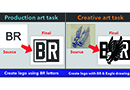
The basketball team’s design was a great example of this. I recently had created a design for a different team that was well received and I thought the layout’s dynamic style also would work well for this artwork. I wouldn’t use any of the elements from the previous design, but the concept was a great starting point. So I started laying out the artwork without a lot of extra trend research because I had already done the work for another team (see Figure 2).
The important point here is that I was given the latitude to keep the elements, but dramatically alter the visual dominance of the team name. The next part, which involved research, was to find a shot-glass photo that could be used to create the graphic, as well as the lime slice (see Figure 3). Again, I decided to go with a more literal depiction of the shot glass and lime instead of making it look like the basketball hoop and ball from the original comp.
The printer agreed that having the subtle appearance of the basketball and hoop, with the shot more prominent, would be more appealing to the client. It also would be clearer in the graphic (we thought the green basketball wouldn’t look like a lime).
Comp Development
We made the decision to go directly into a “tight rough,” which is a computer-rendered graphic that you hope the client will quickly accept. This is a common step for short-turn orders or if the client is open to whatever we came up with and doesn’t come across as too fussy.
Another situation with more complex art or a fussy client would have entailed a pencil comp of the logo and layout to see if both were close to being acceptable. Avoiding this step, however, is a big time-saver and allowed us to get an approval on the very first showing of the artwork (see Figure 4).
Developing this rough, and other designs like it, typically is done using a software program like CorelDRAW or Adobe Illustrator to lay out the typography and create the graphics that wrap around the text. These are skills that a printer or budding artist can develop with practice, but it takes time to learn the tools and steps to manage all the design elements enough to create a variety of artwork.
Practice is the most important piece of learning how to accomplish these tasks. Also, it takes considerable patience to wade through the hours of figuring out how to make the artwork look the way you and your clients prefer.
Once you’ve mastered this process, you will have a leg up on other printers and be extra prepared for the next napkin sketch that floats into your shop.
Thomas Trimingham has been working with screen printers for more than 22 years as an industry consultant, freelance artist, and high-end separator. For more information or to comment on this article, you can reach Thomas through his educational website: screenprintingartist.com.
April 27, 2023 | Graphics + Design
When it comes to creating a design layout for a hat, hoodie or T-shirt, there are some basic concepts it’s important to keep in mind to create a design that’s pleasing to the eye, catches your attention and draws you in. One of these concepts is focal point.
FULL STORY
May 18, 2022 | Graphics + Design
According to Erik Cartmill, president of Cornerstone Impressions, Fort Worth, Texas, his business operates on the following philosophy: “Where there’s a Bill, there’s a way.”
FULL STORY
March 3, 2022 | Graphics + Design
“But I’m not an artist!” the screen printer said on the phone for the second time. He had agreed to do some work for his best customer, with a last-minute request for artwork help.
FULL STORY