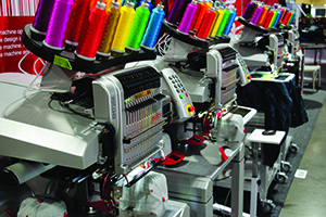
Machine Embroidery Needles 101
Understanding the differences between machine embroidery needles and knowing which needle to use for each project will go a long way in developing your skills as a proficient commercial embroiderer.
FULL STORY

(Editor’s Note: This article is the first in a four-part series on realistic designs.)
Approach is everything when you want to digitize realistically. This four-part series, “Digitizing Realistic Designs,” will cover how to approach digitizing so your work comes out looking more realistic and dynamic.
Your typical landscape will often have the following: sky, mountains or hills, trees, and a meadow or water. The first thing you want to consider is depth. The sky is behind everything, then the mountains, then the trees, etc. This generally will be the order of progression as you digitize, but that alone will not give you the illusion of depth.
Over the years, I have noticed that vertical stitches have more loft than horizontal stitches. So, in addition to working from background to foreground, it is best to have a sky in which the fill is horizontal (left to right) with details like mountains filled at an angle. The more the angle approaches vertical, the more loft it gets. The closer the stitch is to the foreground, the more vertical it should be. Another way to create realism is to give elements that are closer to the viewer more detail. Trees in the background may just be a fill stitch, but trees in the foreground should feature more detail like branches, groups or clumps of leaves and, on occasion, individual leaves.
There are several ways to create a row of pine trees. One approach is to use a vertical or near vertical fill stitch with a random pattern. In Pulse, use the fill stitch labeled “Random.” In Wilcom, use the settings in “Tatami” and change the “A pattern” to .5 and the “B pattern” to 0. Change “Random” to 15%-80%. You can add even more depth by adding several rows of the same stitch fill, one on top the other. A simple but impressive way is to use a satin stitch with “Auto Split Stitch” (known as “Random Split Stitch” in Pulse.) Feel free to turn it down from the standard 7 mm until the fill starts looking more like soft branches. (Part 2 of this series will explore trees in more depth.)
Water and ground should still look flat, even if they are in the foreground. Use just a little bit of angle, if you desire. It is best to use horizontal stitches for rivers that go on into the distance. Don’t be tempted to curve the angle of the stitch like you might do with the letter “S”; this will only create loft and break the feeling of realism.
When doing reflections in water, stitch the water and the reflections in the same direction and pattern, so the fill patterns match. This helps unify the reflection with the water. To give the reflection ripples add a jagged edge.
To create majestic mountains, focus on depth. Angle of stitch is important. Keep your angle close to horizontal for the mountains in the background and slightly steeper for those in the foreground. If there is a range of mountains, you can break it up in layers, either by changing the stitch direction or the stitch pattern. Look at the natural lines and ridges and imagine how they might progress inwards and that is where your next mountain range should begin.
With mountains that have two different sides, the key is to treat them with opposite angles so one side does not look as if it is in front of the other. For mountain caps, use a fill stitch that is at a similar angle as the mountain itself. You don’t want the snowcaps to look like they are sitting on top of the mountain, but rather like they are part of them. If the snow parts are too small for fill stitch (generally I would not go below 5 mm for the width of the stitch), then use satin, but keep in mind that satin tends to look loftier than fill stitch. Keep your density and underlay at a minimum.
As mentioned previously, sky should consist of horizontal fill stitch. Working in this direction also helps with blends, making it easier to create a bright sky that fades into the horizon. Wispy clouds also should be created in the same or close to same direction. Lighter clouds can be done in an open fill stitch with a density of about half as much as normal. Cumulous clouds (the big pillow-like ones) can break the rule about loft. Even though they are in the background, vertical or near vertical satin stitches applied in split stitches will give the clouds a nice puffiness. Just like the mountains, give the clouds more definition by treating the same cloud as separate parts and having billows overlap.
When digitizing, have a philosophy. Keep your stitch styles consistent. Perhaps keep one type of pattern for one kind of object (such as a mountains) and another pattern or angle for the object next to it. Also, don’t use an obvious pattern when digitizing nature. If the fill pattern you use is too distinctive, it will look less realistic.
Jesse Elliott is digitizing product manager of Artwork Source. For more information, visit artworksource.com.
Understanding the differences between machine embroidery needles and knowing which needle to use for each project will go a long way in developing your skills as a proficient commercial embroiderer.
FULL STORYWhether you’re running a small boutique embroidery shop or managing a large-scale decorated-apparel operation, attracting more customers to your business is crucial for growth and sustainability.
FULL STORY
There’s nothing more frustrating than being under pressure to get a job out and having something go wrong—and there are so many things that can go wrong!
FULL STORY