April 1, 2013
In 1987 when my brother Keith and I entered the embroidery industry, we were told we could not blend colors with our commercial embroidery machines. At that time, the art that was used for digitizing was called a cartoon, and the result you got from digitizing it was the same — a cartoon.
When we won the Grand Prize in an industry embroidery contest in the late ’90s with an embroidered “painting” that was 2′ x 3′ and totally blended, we (and America) became known for blending colors.
The technique of blending thread colors took months to perfect and we had to address the default, or power up values, in our software. To successfully blend colors, you must know how to mix colors. You also must know how to change the densities in your blends, control the direction or angle of your stitches and learn certain physical constraints that are entailed in this art.
Let’s start with mixing colors. If you look at the color wheel, you will see red, yellow and blue. These are the primary colors, so named because they cannot be created by mixing two or more colors.

Halfway between the red and yellow, you will see the color orange. This is a secondary color, or a mix of half red and half orange. So a mix of red and yellow will result in orange. As you go from yellow to blue, you will see that the color green is in the middle. This shows you that yellow mixed with blue will result in green. Finally, moving from blue to red, you will find violet, or purple. Likewise, a mix of blue and red will result in violet.
From there, if you look at the shade of color between red and orange, you will see red-orange. To mix this color, you will need twice as much red as you mixed with yellow when you created orange. The same is true when you look at the shade of orange closest to yellow. The yellow-orange created here has twice the yellow mixed with the red as when you mixed orange. Looking at the transition from yellow to blue, you will see yellow-green, green, blue-green, then blue. From blue to red, you will see color gradations from blue to blue-violet, to purple, then red-violet — or maroon — and then red.
If you mix all three primary colors, you will get brown. The same will happen if you mix any two of your secondary colors: orange and green, green and violet, and violet and orange. When you start to mix thread colors, you need to be sure that you are dealing strictly with pure colors. For example, make sure you have a pure yellow if you are mixing it with green. If the yellow has even a hint of orange in it, the resulting yellow-green color will have a brown cast to it.
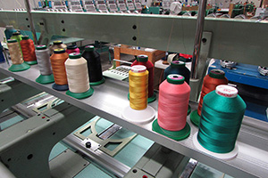
To be sure that you choose a shade of yellow that has no orange in it, check your thread chart for shades of yellow that surround it. The thread chart is arranged by “color families.” The shades of thread colors close to the shade you are using will be a subtle blend of that color and the colors that immediately follow it in the chart. You will find that two cones of yellow thread that look exactly the same to the naked eye are, indeed, different if they have different numbers and are in different places in your charts. One will have some orange in it, while the other will contain some green.
In looking at your thread chart, you will find this is true of all of the primary colors. Knowing this will help you in choosing the cone or spool of thread you will need for blending.
To make a successful color transition, or a gradual blend from red to yellow, you must use a cone or spool of orange. As indicated on the color wheel, mix red with orange and orange with yellow. The red is more aggressive than the yellow and, accordingly, is difficult to gradually blend into the orange.
DENSITY DETAILS
Gradual blends create realism. I have found that a gradual blend from one color to the next can successfully be done by going over that area with three different shades, or three layers, of thread. Using 100% density on each layer will not work. This means that each layer has to be 1⁄3 of the default value you have assigned to your full fill or tatami stitch.
If you take an object — a square or circle that is fully filled — check the number of stitches in that object. Divide that number of stitches by 1⁄3. If the full fill is 1,500 stitches, you will need to reduce density to give you 500 stitches for each layer in that object. This will be your default value for your layered fill and this will allow you to blend.
For this exercise, let’s start with a true red. At the end where it is most intense, you will have three layers of the light density fill. As it progresses toward the orange, it will get progressively lighter, as you see pictured in Slide A, in the attached photo gallery.
The first section goes down (Slide A1), the second section of red overlaps the first and the color fans out (Slide A2). Then, the third layer of the same fill overlaps the first two layers and the color fans out (Slide A3).
Next, we will use our yellow and do the same, this time starting on the right side and placing down three layers of yellow so that the most intense area is to the far right (Slide A4). Next, we will set up the orange for the center of our blend. This time, we will start in the center (Slide A5), placing our first layer of orange so that it starts at the lightest section of red and ends at the edge of the lightest section of yellow.
Then, we will add the next layer of orange starting at edge of our second layer of red, cover the first layer of orange and end at the end of our second layer of yellow (Slide A6). Finally, we will add our third layer of orange to complete this image with 100% coverage between the most intense part of the red and the most intense part of the yellow, as shown in Slide A7.
The artistic rules of blending are shown by the blends you see in you color wheel. There are two physical rules:
1. You cannot put a stitch on top of a stitch.
2. Layers of stitches that go the same direction — or are placed at the same angle — will sink in and blend, while changing that angle even slightly will cause that layer to stand up on top of the layer below it.
In this case, all layers of your fill are going horizontally. Even though you are taking the same object, duplicating it and spreading it out further than the layer below, no stitch will be placed on top of any of the ones below it. The needle will be deflected to the point of least resistance, and the lines of stitches in the second and third layers will be placed between the lines of stitches that already are there. By running the colors between the lines, your eye mixes them naturally and causes the colors to blend.
This is the perfect mix of art — through the color wheel — and the physics that govern machine embroidery. Understanding both will give you the perfect color blend and also the tools to use those blends to shade your designs and give them realism and life, which is what I will cover in next month’s issue of Impressions.
Lee Caroselli-Barnes, owner of Balboa Threadworks Embroidery Design, is known for her innovation and excellence in embroidery digitizing. She has 30 years of experience in the embroidery industry. For more information or to comment on this article, email Lee at balboainfo@aol.com. Hear Lee speak on digitizing topics at the 2013 Imprinted Sportswear Shows (ISS). Individual seminars are just $25 if you preregister: issshows.com.
July 28, 2023 | Design + Digitizing
Very few things in life stand the test of time. As natural as the ebb and flow of evolution, most seemingly universal customs are founded and practiced with vigor, only to fade away with a whisper as the years tick by.
FULL STORY
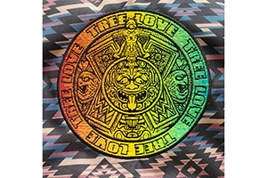
August 16, 2022 | Design + Digitizing
With this month’s On Design, we travel deep into the jungles of Central Mexico, harkening back to an ancient time where the Aztecs roamed the earth whilst building a formidable empire.
FULL STORY